
Walmart
Online Shopping Made Easy
Role
Design Lead
UX Designer
UI Designer
Duration
1 Month
(2021 Nov - Dec)
Tools
Figma
Photoshop
Illustrator

OVERVIEW
Walmart's online shopping application offers customers three ways to get their orders: pickup, delivery, and shipping. These three ways make online shopping more organized and clear on one hand, but on the other hand, they create some confusion and inconvenience for the customer, which was the main problem our team had to solve.
Have you ever had a problem like my friend Cindy's...?
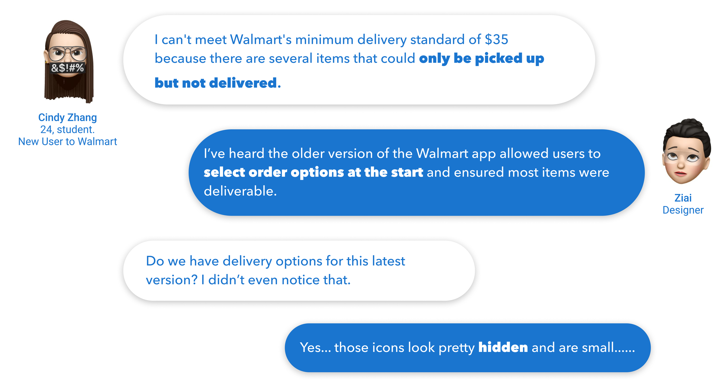
After I asked my team members to look up user feedback from diverse social platforms, we found Cindy was not alone...
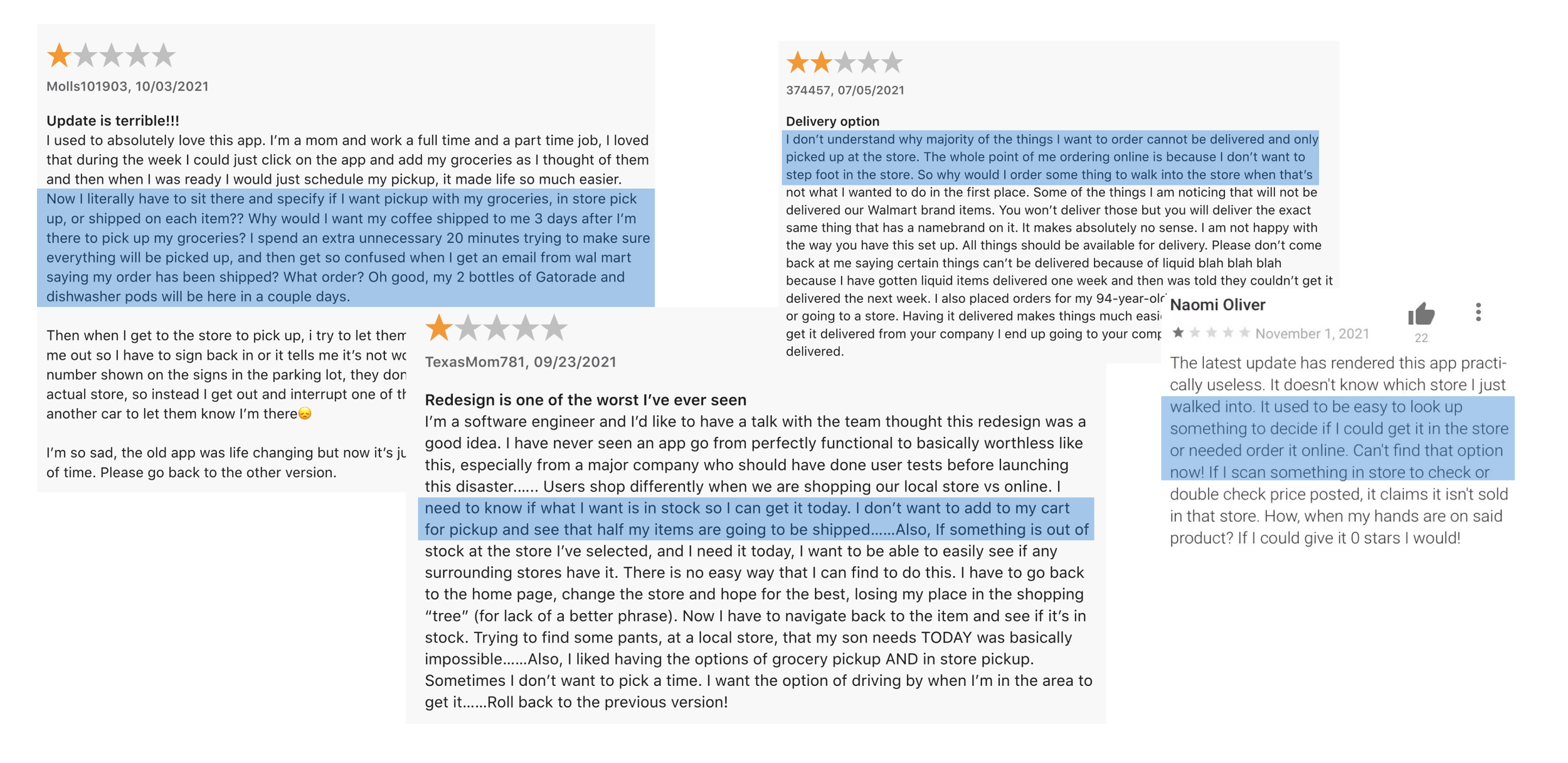
Need to specify delivery options on each item.
Have to make sure everything will be available for pick up or delivery.
User Voices:
Delivery options are not evident on the interface.
Cannot filter off incompatible options.

What do those issues look like on the interface?

- Order options look very small on the interface.
- The option for delivery is hidden under the pick & shipping tag.

After you select delivery, some results are confusing...

Pickup & 3+ day shipping items appear under the delivery option.
When you get to the last few steps you're notified that certain item can't be delivered.
Pay more money when the price doesn’t meet $35.
Or spend more time on picking other items you don’t really want to fill the gap.
Through previous research, I found that our users want to shop efficiently. Picking incompatible items will make them pay more on delivery fees or even spend more time picking up other things they don't want to meet the $35 threshold.
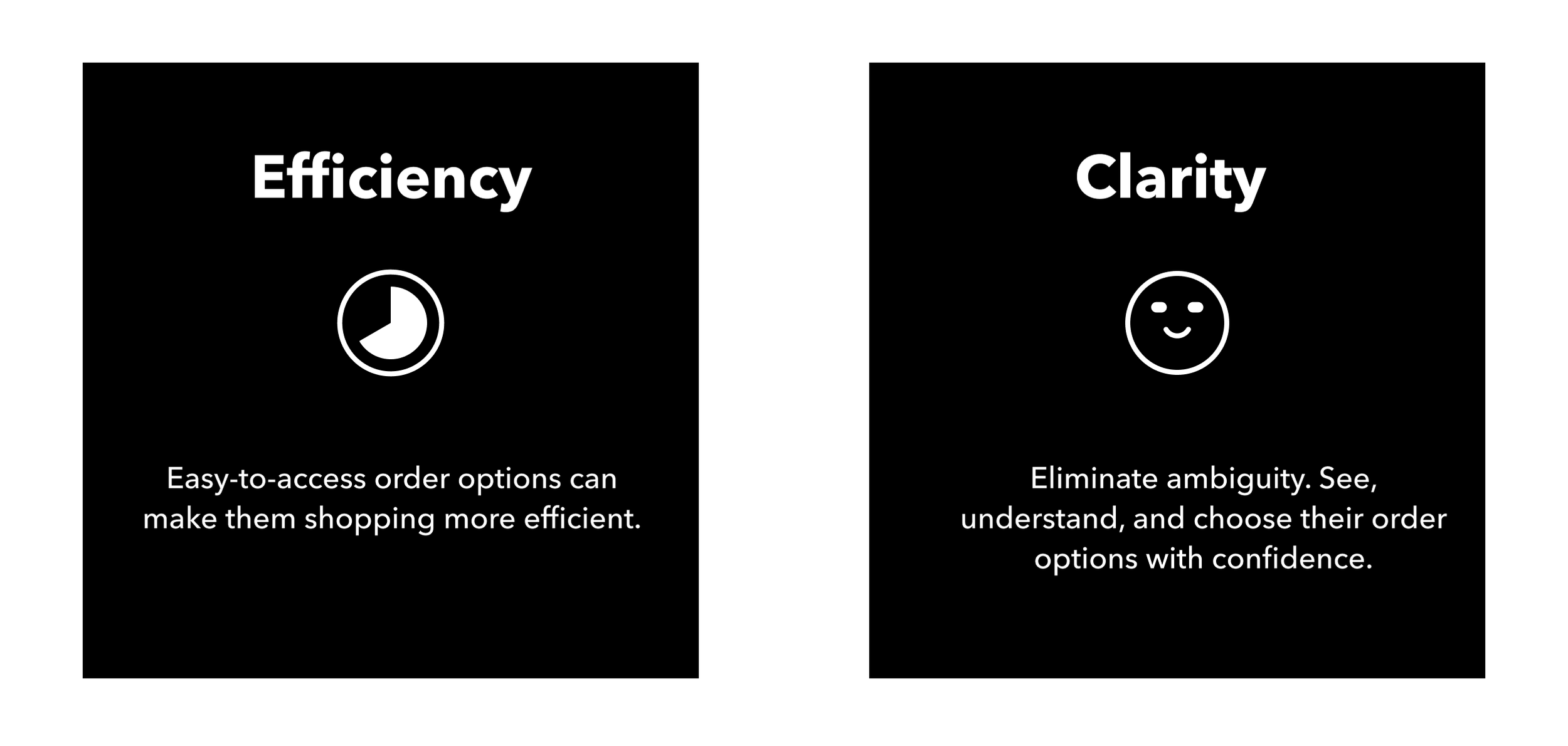
User Needs
OUR USERS WANT:

How might we create a user-friendly order option system so that customers can shop efficiently without spending time on incompatible items?
An Easy-To-Access Delivery Option
There are three design directions for the delivery option. It's all about improving users' shopping efficiency.


Design Exploration
ORDER OPTION ON THE HOMEPAGE
After I did user testing on this version, I found more than half of the eight testers who had used Target before (an online shopping platform) said this version was not simple enough to go through. Then I used Target as a reference to improve the user flow.
Now we only need two steps!

Information is now arranged compactly. Users can easily switch to other order options and easily change time, address, and store options.
Delivery option on the search page
TAGS & PILLS

”When I want to select pick-up only/delivery only, I would like to filter off incompatible items to ensure all items are accessible.”
- There are too many pills in one line.
- Some pills appear to be functionally redundant and can be combined with other pills
Craft
It’s all about details!

Order option on
the bottom
Order option on
the top

ORDER OPTION ON THE RIGHT
SELECTION DESIGN

I also specify the icon for the store location and the address icon for shipping and delivery.
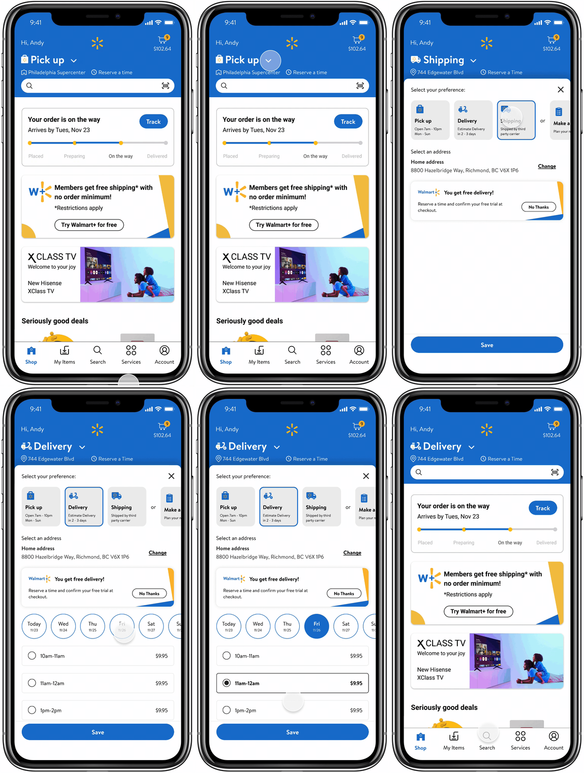
Choose the order option at the very beginning
Customers are able to select the order option at the outset to ensure that filtered items are deliverable, ready for pick-up, shipped, or stored in the shop.
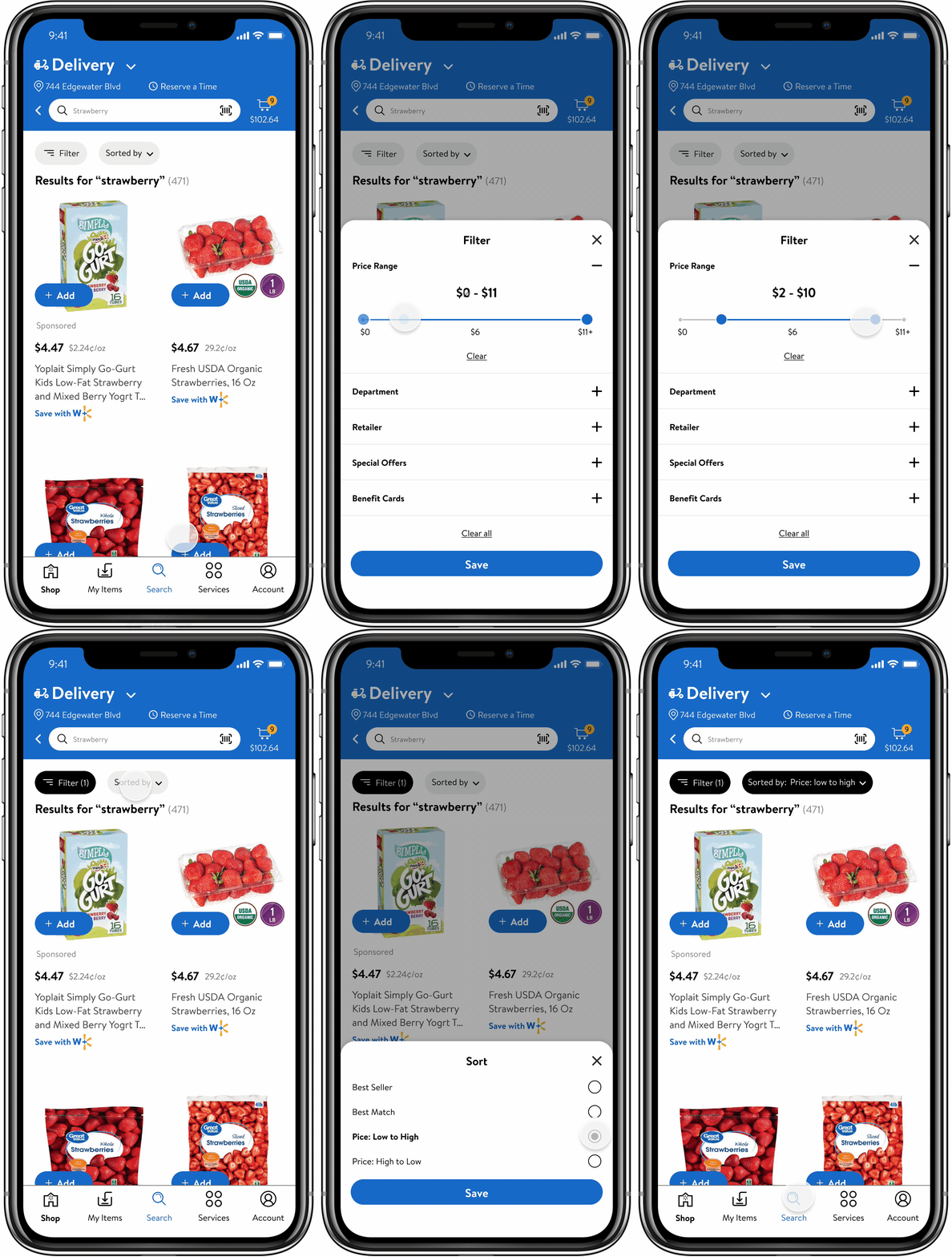
Filter off incompatible items
To build a simple and user friendly ecosystem.
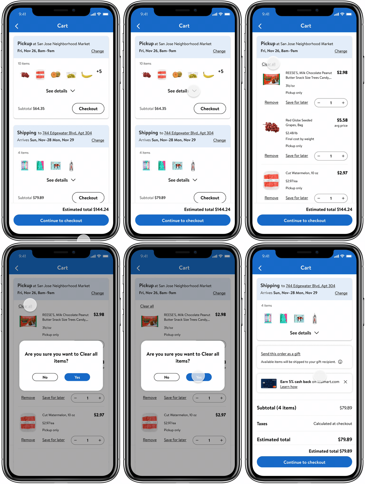
We also consider other features:
Clear All
In interviews, six out of eight users say they had to clear items one by one, which is very time-consuming. Therefore, the function of removing items at once becomes efficient.

Desktop Display


Cindy says, “Now, I’m feeling I can shop faster without frustration!”
RETROSPECTIVE
Usability testing influences the decisions we make about design direction and design details. Without usability testing, we would not have a more comprehensive understanding of the needs of our users.
In design, we also believe that too much information does not add value to the product. We should follow the principle of simplicity, which means not only visual simplicity but also the clarity of information.


